Your website is often your first impression—and in 2026, people expect more than just a pretty homepage. They expect clarity, ease, and trust. But don’t worry: you don’t need to be a tech expert to create a site that feels polished and modern. These five beginner-friendly tweaks will instantly elevate your website and help your brand look like the real deal.
1. Beginner-Friendly Tweaks: Use Clear, Clickable Calls to Action (CTAs)
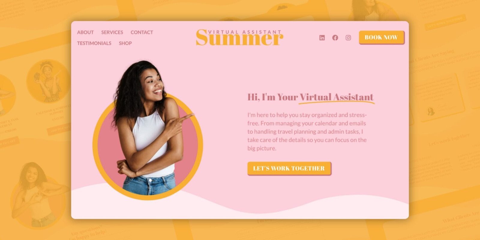
If your buttons say things like “Click Here” or “Submit,” it’s time for a glow-up. In 2026, CTAs (Calls to Action) are expected to be clear, specific, and encouraging.
Try this instead: – “Book Your Free Call” – “Download Your Guide” – “Join the Newsletter”
Also: make your buttons large enough for mobile users, and give them room to breathe with whitespace (empty space around the element).

2. Choose One Font Pairing and Stick to It
Design doesn’t have to be complicated. In fact, consistency is what makes your brand feel polished. Stick to one main font for headings and one for body text.
Pro tip: Use Google Fonts or Canva’s built-in font pairings to find modern, legible combinations. In 2026, clarity is the new luxury.

3. Beginner-Friendly Tweaks: Prioritize Mobile-First Layout
More than 60% of traffic comes from mobile devices—and that number is still climbing. Mobile-firstmeans you design for the smallest screen first, ensuring that:
- Text is easy to read without zooming
- Buttons are thumb-friendly
- Images scale correctly
Tools like Elementor or Squarespace have mobile preview modes. Use them. A great mobile experience instantly makes your site feel more professional.

4. Add Accessibility Basics (So Everyone Feels Welcome)
Accessibility isn’t just a tech term—it means your site works for more people, including those with disabilities.
Here are beginner steps:
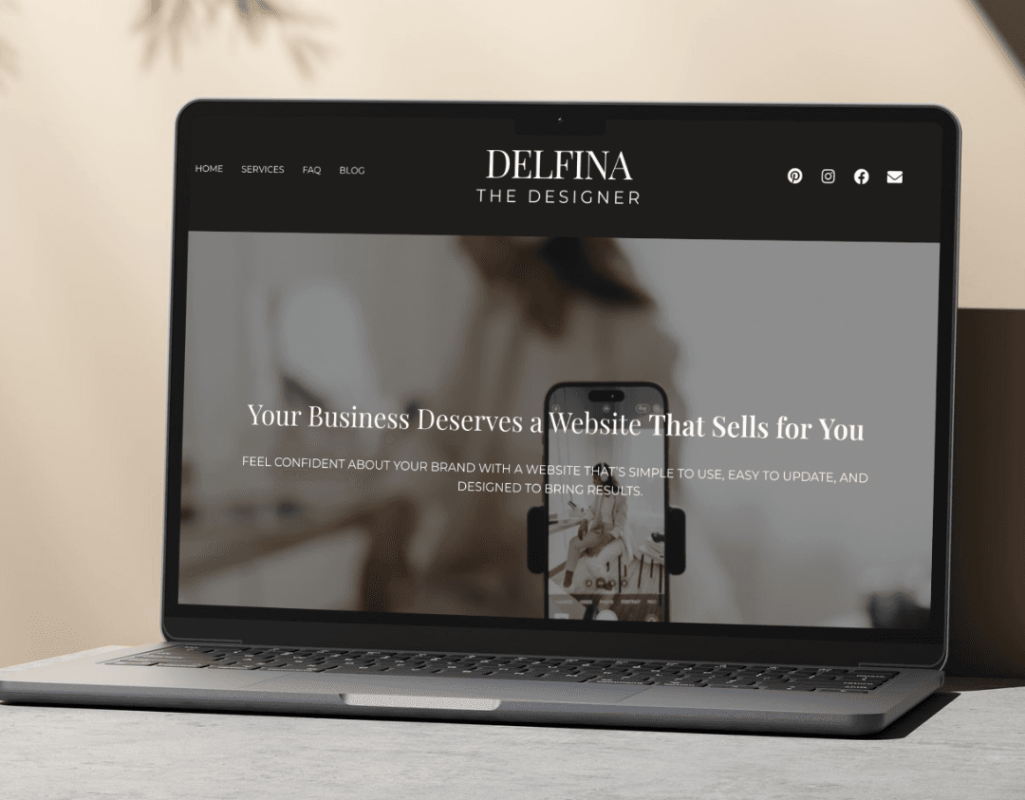
- Use high-contrast color combos (dark text on a light background, or vice versa)
- Add alt text (short descriptions) to all images
- Structure your page using headings (H1, H2, etc.)
This not only helps visitors but also improves your SEO (Search Engine Optimization = how Google finds your site).

5. Refresh with 2026 Visual Trends—Subtly
You don’t need to redesign everything. Just update one or two elements to feel current.
Examples:
- Try soft gradients instead of flat colors
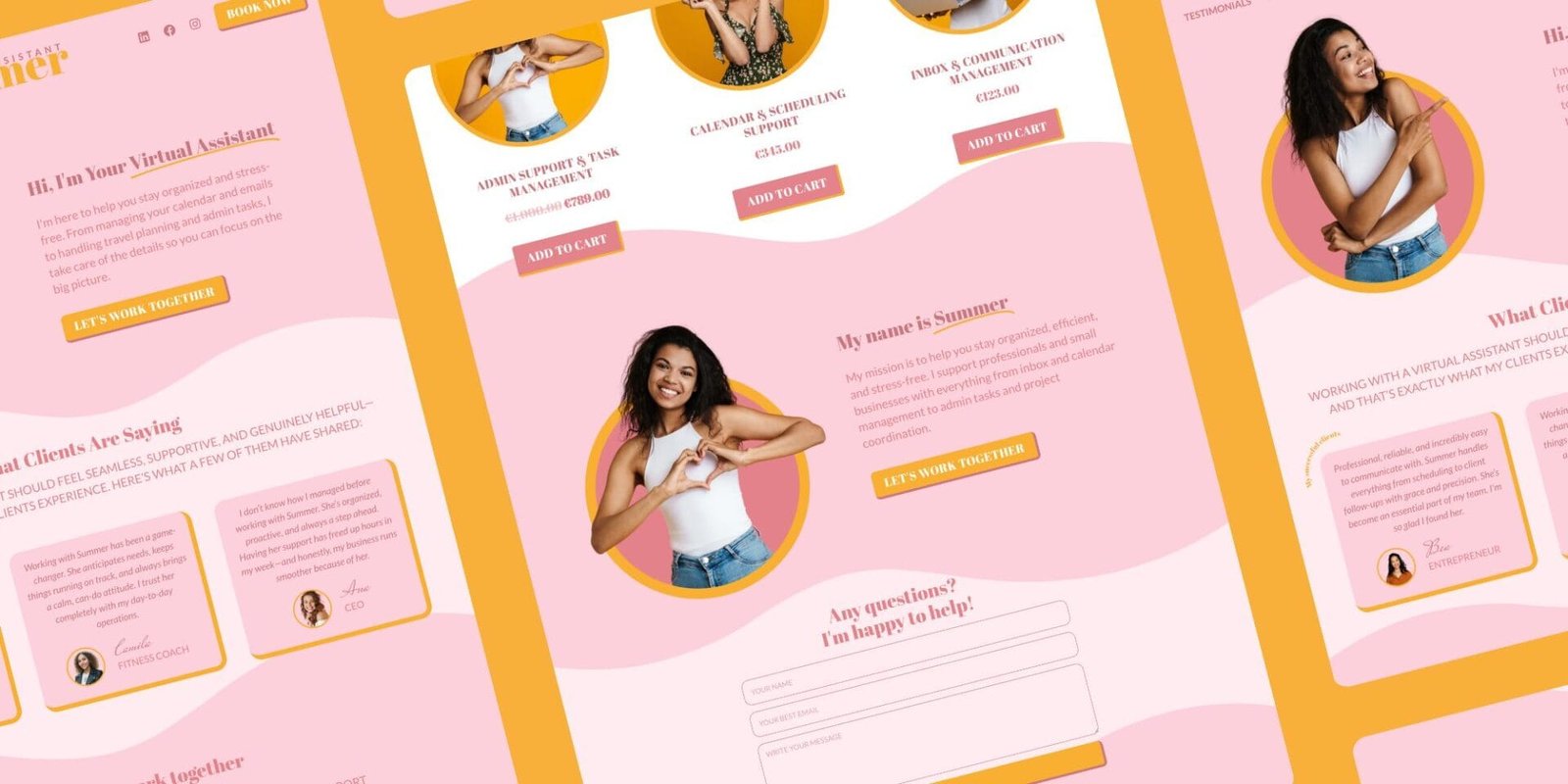
- Use modern, abstract shapes as backgrounds
- Add a dark mode option (great for battery saving and eye comfort)
Keep it minimal, elegant, and aligned with your brand’s vibe. Less is still more.


